Guide to Iconic Luxury Watch Design Elements
k, but the way the light hit those Mercedes hands and that matte dial… I was gone. That was the moment I realized: luxury watches aren’t just expensive timekeepers, they’re a language of design.
Over the years, I’ve bought, sold, flipped (and occasionally regretted selling) more watches than I’d like to admit. Along the way, I started noticing the same recurring design elements that separate the truly iconic pieces from the forgettable ones.
This guide is my personal walk-through of those elements—what they are, why they matter, and how you can spot them when you’re browsing, collecting, or just drooling over watches online.
The Case: Shapes That Became Legends
When I first tried on an Audemars Piguet Royal Oak, I finally understood why collectors obsess over case design. It wasn’t just the octagon. It was the mix of brushed and polished surfaces, the sharp bevels, the integrated bracelet. It felt like architecture on the wrist.
Round, Tonneau, and Beyond
Most luxury watches are round, but the iconic ones twist that simplicity:
- Round with attitude – Think Rolex Submariner or Omega Speedmaster. Classic circular cases with purposeful crown guards, defined lugs, and precise proportions.
- Tonneau (barrel-shaped) – The Richard Mille look that screams “modern money.” I tried one on once; it wore like a little race car chassis wrapped around my wrist.
- Rectangular and square – Cartier Tank, Jaeger-LeCoultre Reverso. The first time I wore a Tank, it felt less like a watch and more like a design object.
In my experience, the most iconic cases share three things: consistent proportions, a recognizable silhouette from across the room, and finishing that looks good even under harsh boutique lighting.
Finishing: The Invisible Luxury
People talk about complications and brand names, but what quietly separates a $1,000 watch from a $20,000 one is often finishing.
When I tested a Grand Seiko against a similarly priced Swiss piece, the Zaratsu mirror polishing on the GS lugs made the Swiss watch look almost dull. On iconic cases, you’ll often see:
- Sharp transitions between brushed and polished surfaces
- Uniform brushing on lugs and bracelets, all flowing in the same direction
- Crisp bevels that catch the light like jewelry
Brands like Patek Philippe and Audemars Piguet obsess over this. It’s not always obvious in photos, but once you’ve handled a few in person, you can’t unsee it.
The Dial: Where Personality Lives
Dials are where I fall in love—or instantly swipe left.
Iconic Layouts
A few dial formats have become visual shorthand for luxury:
- The Submariner-style diver – Large luminous markers, rotating bezel, clean three-hand layout. Rolex refined this in the 1950s, and almost every dive watch since is in conversation with it.
- The tri-compax chronograph – Three sub-dials at 3, 6, and 9 o’clock, like the Omega Speedmaster or Zenith El Primero. It’s functional symmetry that feels almost… satisfying to stare at.
- The minimalist dress dial – Thin markers, no date (or discreetly placed date), and lots of negative space. The Patek Calatrava essentially wrote this rulebook.
When I first compared my Speedmaster to a generic chronograph, the difference wasn’t the extra sub-dial or branding—it was how balanced everything felt. The logo, text, markers, and hands all had intention.
Texture and Depth
Flat dials can be beautiful, but iconic luxury watches often add texture and layers:
- Tapisserie patterns on the Royal Oak
- Clous de Paris guilloché on certain Patek models
- Sunburst finishes that shift color with the light
I once spent a full flight just watching the sunburst blue on a Grand Seiko dial move between navy and almost teal as the cabin lighting changed. That’s the kind of subtle drama you start paying for at the higher end.
Color: From Conservative to Viral
Traditionally, luxury meant black, white, or silver dials. Then came the green Rolexes, Tiffany-blue Patek Nautilus, and bright-colored Omegas.
Pros:
- Bolder colors feel modern and fun
- They stand out on social media and in real life
Cons:
- They can age quickly if they’re too trend-driven
- Resale is risky unless the model becomes “the one” collectors chase
Personally, I love restrained colors with character: deep green, smoky grey, rich blue. They stay interesting without feeling like a fad.
Hands & Markers: Tiny Details, Huge Impact
I used to overlook hands and indices. Then I handled a watch where the hands barely reached the minute track, and the whole piece felt… wrong.
Signature Hand Styles
Certain hand designs are practically brand signatures:
- Mercedes hands – Rolex sports models
- Snowflake hands – Tudor (especially on their Black Bay line)
- Dauphine hands – Sharp, elegant, used by Patek, Vacheron Constantin, and many classic dress watches
- Baton hands – Minimal, modern, all about clean legibility
When they’re well executed, the hands echo the design language of the case and dial. When they’re generic or undersized, even a high-end watch can look cheap.
Indices and Lume
Iconic markers are often simple but distinctive:
- Round and rectangular indices on the Submariner
- Applied Roman numerals on Cartier
- Double markers at 12 o’clock for orientation
Lume (the glow-in-the-dark material) is another signature. I remember turning off the lights after getting my first proper diver and being weirdly thrilled by how evenly and intensely it glowed. Modern Super-LumiNova and Rolex’s Chromalight aren’t just functional; collectors debate their color, intensity, and longevity.
Bezels: Function Meets Identity
If cases are architecture and dials are faces, bezels are the eyebrows—change them, and the whole expression shifts.
Dive, GMT, and Tachymeter
- Dive bezels – Unidirectional, 60-minute scale, chunky grip. The Submariner and Blancpain Fifty Fathoms define this look.
- GMT bezels – 24-hour scale, often bi-color to show day/night (think Rolex Pepsi or Batman). When I tested a GMT-Master II while traveling, tracking home time became addictively easy.
- Tachymeter – Speed-measuring scales on chronograph bezels like the Speedmaster. I rarely use it, but I’d absolutely miss the look if it were gone.
Materials and Durability
Older watches used aluminum inserts that fade and scratch. Modern luxury pieces lean on:
- Ceramic – Scratch-resistant, color-stable; launched in a big way by brands like Rolex and Omega
- Sapphire – Used on some high-end or vintage-inspired models
Pros of ceramic: it looks brand new for years. Cons: it can shatter if hit hard enough. I’ve seen a cracked ceramic bezel once in person; fixing it wasn’t cheap.
Bracelets & Straps: Comfort Is King
The day I realized how much a bracelet matters was the day I swapped an integrated bracelet Royal Oak for a NATO strap on another watch. Both were steel, both expensive—but the AP felt like jewelry and the NATO felt like a weekend.
Iconic Bracelets
- Oyster bracelet – Rolex’s three-link workhorse: robust, sporty, everywhere.
- Jubilee bracelet – Rolex again; five-link, dressier, super comfortable.
- Royal Oak and Nautilus bracelets – Integrated into the case design, not just attached to it.
Integrated bracelets look incredibly cohesive but limit strap swapping. As someone who loves changing straps to match outfits or moods, I’m always a bit torn about that.
Clasps and Micro-Adjustments
Luxury bracelets quietly justify their price with details like:
- Milled clasps (solid, precise, not stamped)
- On-the-fly micro-adjustments so you can tweak fit as your wrist swells in heat
Rolex’s Glidelock and Tudor’s T-Fit, for instance, are game changers on humid days. I used to ignore clasps; now I check them almost before the dial.
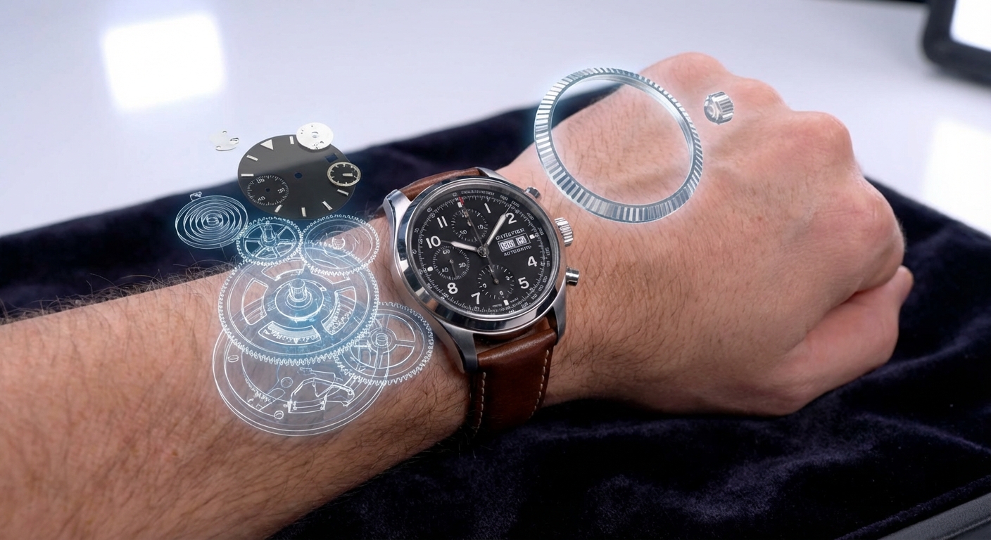
Movements: What’s Under the Hood (and Why It Matters)
Design isn’t just what you see. In watch collecting, the movement is part of the design story.
In-House vs Outsourced
I’ve worn ETA-based watches and in-house calibers, and honestly, both can be great.
- In-house movements: More prestige, sometimes better integration with case design, but can be pricier to service.
- High-grade outsourced movements (like ETA or Sellita): Easier and often cheaper to maintain, widely understood by watchmakers.
For instance, Rolex and Patek are famous for in-house calibers, while brands like Tudor started with ETA and now mix in-house with modified movements.
Decoration and Display Backs
Flip a Lange or Patek and you’ll see bridges with Geneva stripes, polished screw heads, chamfered edges—all design elements aimed at the owner, not the public.
Some iconic luxury watches (e.g., many Rolex sports models) don’t use display casebacks at all, emphasizing robustness over show. I respect both approaches.
Pros & Cons of Chasing Iconic Design
After years of experimenting, here’s how it shakes out for me.
Pros:- Iconic designs tend to age well and hold value better
- They’re usually more refined ergonomically and visually
- Easier to resell or trade if your taste evolves
- You’re often paying a hefty premium for that “icon” tax
- Everyone else might be wearing the same thing
- Some iconic designs are over-hyped compared to lesser-known but equally well-made alternatives
I recently tried a microbrand diver next to a major Swiss icon. The Swiss watch won on finishing and history, but the microbrand nailed comfort and originality at a fraction of the price. There’s room for both.
How to Develop Your Own Eye for Iconic Elements
Here’s what helped me move from casual admirer to more discerning enthusiast:
- Handle as many watches as you can – Boutiques, pre-owned dealers, trade shows. Photos lie; wrist feel doesn’t.
- Compare directly – Put a well-known icon next to a lesser-known piece. Notice case lines, dial printing, hand length.
- Study the greats – Research the Submariner, Speedmaster, Royal Oak, Nautilus, Tank, Reverso. You’ll start seeing their DNA everywhere.
- Listen to watchmakers and historians – Their commentary on design and engineering will change how you see even simple watches.
At the end of the day, iconic elements are a toolkit, not a checklist. Some of my favorite pieces break the “rules” entirely but still feel cohesive and intentional.
If you walk away from this guide and find yourself staring a little longer at watch lugs, bezels, and hands than you did before, that’s the real win.
Sources
- Rolex Submariner History – Official Rolex - Official overview of a foundational dive watch design
- Omega Speedmaster Moonwatch – Omega - Classic chronograph design and specs
- Audemars Piguet Royal Oak: Design History – Audemars Piguet - Origins of the iconic octagonal case and integrated bracelet
- The History of the Dive Watch – Forbes - Background on dive watch design becoming a luxury staple
- Horology: The Science of Time – MIT - Educational perspective on watchmaking and timekeeping