Feature Wall Styling Guide
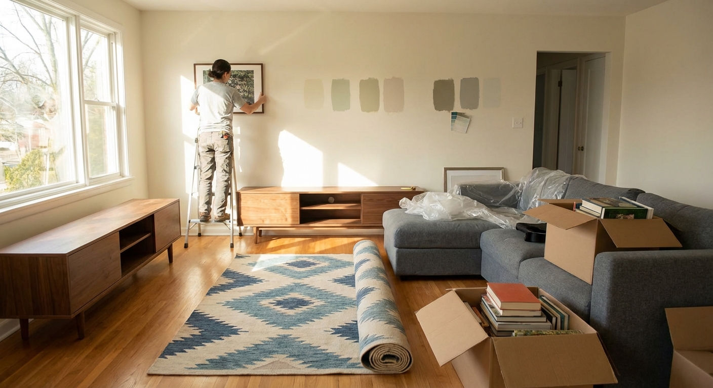
I remember the first time I tried one. I’d just moved into a rental with beige-everything. When I tested a deep inky blue on one wall in the living room, I honestly panicked halfway through: it looked way too dark. But once the room was put back together, that wall became the anchor for the entire space. Friends walked in and said, “Whoa, this suddenly looks designer-y.” That’s the power of a well-styled feature wall.
This guide is everything I’ve learned from designing feature walls for clients, testing paint and materials in my own home, and nerding out over interior design research.
What Actually Makes a Feature Wall Work?
A feature wall (or accent wall) isn’t just a random wall you paint a different color. It’s meant to:
- Create a focal point
- Visually organize the room
- Highlight architecture or a key function (like the bed wall or TV wall)
When I walk into a room, I look for the “natural focus.” That’s usually:
- The wall behind the sofa
- The wall behind the bed
- The fireplace wall
- The wall opposite the main entry sightline
If you choose a wall that already gets attention, the feature feels intentional instead of forced. I once had a client who wanted the tiny side wall near the door painted bright red; it ended up feeling like a random warning sign. We switched the feature wall to behind the TV unit and the whole space calmed down.
Step 1: Decide the Purpose of Your Feature Wall
Before color, wallpaper, or paneling, ask: What is this wall doing for the room?
In my experience, feature walls usually serve one of these purposes:
- Framing a function
Example: A dark, moody wall behind the TV so the screen visually recedes.
- Balancing a room
If one side of the room has big windows and the other side feels flat, a feature wall can rebalance visual weight.
- Adding depth to a small space
Contrary to the myth, a darker color on one wall doesn’t always make a room feel smaller. Used right, it creates depth and makes the room feel more layered.
- Highlighting architecture
Think fireplaces, alcoves, niches, or a beautiful sloped ceiling.
Once you pick the purpose, every choice that follows—color, texture, decor—gets way easier.
Step 2: Choose the Right Wall (and Avoid the Wrong One)
Here’s how I practically choose a wall when I’m standing in a space:
- Stand at the main entrance to the room.
Which wall do your eyes hit first? That’s candidate #1.
- Check for interruptions.
Too many doors, windows, vents, or radiators? That wall’s usually out.
- Look at furniture layout.
If your bed or sofa can’t center on the wall, the feature might feel off-kilter.
One mistake I see a lot: people feature the shortest wall in a long narrow room. When I tested this in a client’s narrow bedroom, the end wall in dark green made the room feel cut off. When we switched the feature to the longer bed wall with vertical paneling, the room suddenly felt taller and more cohesive.
Step 3: Color, Texture, or Pattern?
There are three main directions a feature wall can take.
1. The Classic Painted Feature Wall
When I tested dozens of paint options with clients, a few rules really held up:
- Go richer, not just darker.
A muted teal, aubergine, or charcoal often looks more sophisticated than a basic “one shade darker” of your existing wall color.
- Mind the undertones.
If your other walls are warm (like cream or beige), a cool gray feature wall can look slightly “dirty” or cold. I now always compare samples side-by-side in different lighting—morning, afternoon, and at night with lamps.
- Finish matters.
I’ve found an eggshell or matte finish usually works best for feature walls: less glare, more depth. High gloss can be beautiful, but it shows every drywall imperfection.
There’s real science behind the mood effect, too. Color psychology research (like findings summarized by the University of Rochester) suggests blues and greens can support calm and focus, while reds can increase energy and even heart rate. That’s why I rarely recommend a bright red feature wall in a bedroom.
2. Wallpaper That Doesn’t Scream 1997
I used to be anti-wallpaper—too many memories of peeling florals in rentals. Then I tested a modern, textured grasscloth-look wallpaper in a dining room. Game changer.
What I’ve seen work best:
- Large-scale patterns in bigger rooms
- Subtle textures (linen, grasscloth, faux plaster) in smaller rooms
- Geometric or stripe patterns to add structure to modern spaces
Pros:
- Adds instant personality and depth
- Can hide minor wall imperfections better than plain paint
Cons:
- Higher upfront cost
- Removal can be annoying if it’s not quality or properly installed
Removable “peel and stick” wallpaper has been a lifesaver for renters. I tested a peel-and-stick mural behind my own sofa—took about two hours to apply and came off clean a year later.
3. Architectural & Textured Feature Walls
This is where things get fun. I’ve built (and occasionally regretted building) a range of textured walls:
- Wood slat walls for Scandinavian or mid-century looks
- Board and batten or wainscoting for traditional or transitional spaces
- Faux concrete or microcement finishes for modern, loft-style vibes
Wood slats, for example, don’t just look good—they affect acoustics. I noticed echo reduction in a high-ceiling living room after installing vertical oak slats on one wall. There’s research in building acoustics to back this up; textured and absorbent surfaces help diffuse and absorb sound compared with hard, flat walls.
Downside: these projects take real planning—stud finding, level checking, and sometimes a brad nailer. It’s not the ideal “spare evening” DIY if you’re brand new to tools.
Step 4: Styling the Feature Wall Itself
A lot of people stop at paint. The real magic happens when you style the wall and the space around it.
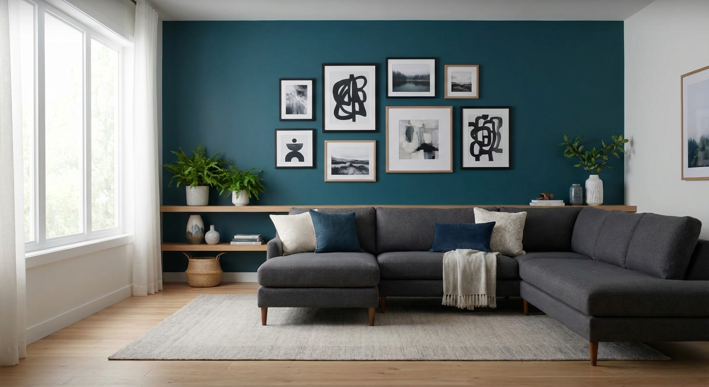
Art and Decor
In my experience, a feature wall needs either:
- One strong central statement (like a large piece of art or a TV and console setup), or
- A balanced composition (gallery wall, shelves, or symmetrical sconces)
When I created a gallery wall over a dark green feature in my hallway, I followed a simple rule: keep frames similar in tone, vary the sizes, and keep the overall shape roughly rectangular. It looked intentional, not chaotic.
Furniture Positioning
The feature wall should anchor something:
- Sofa centered on the wall, with art or a mirror above
- Bed headboard centered, with matching nightstands
- Console table or sideboard against the wall with a lamp and layered decor
When furniture floats awkwardly away or off-center, even the best feature wall feels wrong. I’ve had clients blame the color, but 9 times out of 10 it’s just layout.
Lighting
I underestimated this for years. The same navy wall can look luxurious with warm, directional lighting—or like a black hole under harsh overhead LEDs.
What’s worked well for me:
- Wall sconces flanking a bed or mirror
- Picture lights over art
- A floor lamp aimed at textured paneling
Try warm white bulbs around 2700–3000K for cozy rooms. I once used cool 4000K bulbs on a terracotta wall and it turned a weird salmon-pink at night.
Common Mistakes (I’ve Made Most of These)
- Ignoring the rest of the room
A feature wall can’t rescue mismatched furniture or clutter. It can actually highlight the chaos.
- Too many stars, no supporting cast
If every surface is “special”—patterned tiles, bold rug, bright sofa, busy feature wall—your eye doesn’t rest anywhere.
- Not testing samples properly
I’ve seen colors shift dramatically due to north vs south-facing light. Always test on the actual wall and look at it across a full day.
- Choosing trend over longevity
I love deep green and terracotta as much as Instagram does, but I always ask clients: “Will you still love this in three years?” Neutrals with texture often age better than super-specific trendy prints.
When a Feature Wall Isn’t the Right Move
From a design perspective, I’ve learned to say “no” to feature walls in a few situations:
- Very small, already busy rooms (like tiny bathrooms with patterned floor tiles and bold vanity colors)
- Rooms with low ceilings and heavy beams, where a strong horizontal feature can visually “squash” the space
- Spaces that are already architecturally interesting—sometimes the window wall or original stone is already the star
Sometimes a full-room subtle color, plus great lighting and textiles, beats any single accent wall.
Simple Starting Point: My Go-To Formula
If you’re overwhelmed, here’s a beginner-friendly combo I’ve used multiple times with great success:
- Choose the wall behind your sofa or bed.
- Paint it a rich, muted color (like deep blue-gray, olive, or charcoal) in a matte or eggshell finish.
- Center the main furniture piece on that wall.
- Add one large artwork or a simple 6–8 piece gallery in cohesive frames.
- Layer in warm lighting—table lamps or sconces—aimed toward the wall.
When I tested this formula in a basic rental bedroom with IKEA furniture, it went from “student housing” to “boutique hotel” in a weekend.
If you treat your feature wall as more than just a paint job—as a focal point with purpose, texture, and lighting—it stops being a gimmick and starts feeling like custom design.
And if the first attempt isn’t perfect? That’s normal. I’ve repainted more feature walls than I’d like to admit. But every revision teaches you how you actually live in the space, and that’s the real secret to a wall that doesn’t just look good on Instagram, but feels good every day.
Sources
- University of Rochester – The Science of Color in Design - Overview of how color affects perception and mood
- BBC Future – The Surprisingly Powerful Influence of Color - Discussion of color psychology and its impact on behavior
- U.S. Department of Energy – Lighting Choices to Save You Money - Practical guidance on light types and color temperature at home
- Sherwin-Williams – Accent Wall Ideas - Manufacturer tips and examples for accent and feature walls
- Harvard Graduate School of Design – Architectural Acoustics Overview - Background on how surfaces and textures influence sound in interior spaces