Guide to Softening Feature Walls in Living Spaces
d one living room wall a deep charcoal, sat down with my coffee, looked up, and thought: oh no, I’ve built a cave.
That was the moment I fell down the rabbit hole of softening feature walls—keeping the drama, but dialing down the harshness so the room still feels calm, warm, and actually livable.
This guide is everything I’ve learned (and occasionally messed up) testing different ways to soften feature walls in real spaces.
First: Why Some Feature Walls Feel “Harsh”
When I tested dark and high-contrast walls in a few client spaces, the same complaints kept coming up:
- “It makes the room feel smaller.”
- “I love it in photos, but I’m tired of it in real life.”
- “It looks cool, but it doesn’t feel cozy.”
From a design perspective, harshness usually comes from:
- Too much contrast between the feature wall and surrounding surfaces
- Flat, hard finishes (e.g., high-gloss paint, stone, brick, shiplap) without enough soft elements
- Unbalanced lighting, creating shadows and glare
- Empty, echoey walls with no texture or layering
The trick isn’t to remove the feature wall. It’s to soften its edges—visually and emotionally—so it becomes a backdrop, not a bully.
Strategy 1: Layer Textiles Against the Feature Wall
This is the fastest way I’ve found to calm a strong wall: put softness directly in front of it.
When I recently worked on a small apartment with a black painted wall, the turning point wasn’t repainting—it was adding a floor-to-ceiling linen curtain over the window on that wall. Same color, same intensity, but suddenly it felt like a boutique hotel instead of a basement.
What works well:- Floor-to-ceiling curtains: Even if the window is small, run the rod wide and high. The fabric breaks up the expanse of color and introduces movement.
- Upholstered headboards or sofas against the wall: The softer the fabric (bouclé, velvet, textured linen), the more it visually diffuses the wall behind.
- Textile wall hangings or tapestries: These work particularly well on brick or stone, which can feel cold and echo-prone.
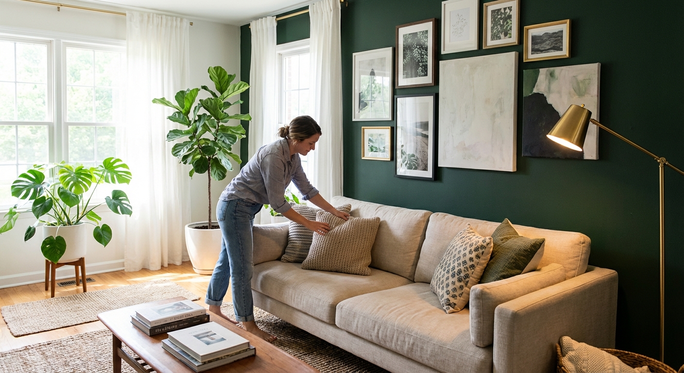
Strategy 2: Break Up the Block with Art Groupings
A big, uninterrupted block of color or stone can feel intense. Breaking it up with art is like adding punctuation to a long, breathless sentence.
When I tested this in my own living room, I started with one oversized framed print centered on the wall. It looked… fine. But once I added a loose gallery wall of different sizes and frame finishes, something shifted. The wall stopped yelling and started whispering.
Ideas that soften instead of cluttering:- Organic arrangements: Avoid overly rigid grids on already strong walls; instead, mix frame sizes and orientations.
- Matte frames: Shiny metal can amplify drama. Soft woods, brushed metals, or painted frames feel gentler.
- Artwork with softer palettes: On a dramatic wall, choose pieces with lighter backgrounds, fluid lines, or organic subjects (botanicals, landscapes, abstracts with curves).
There’s a psychological angle here too: Studies in environmental psychology suggest that natural imagery and curved lines are perceived as more calming than sharp geometric patterns and high-contrast graphics.
Strategy 3: Use Lighting to “Feather” the Edges
Lighting can make or break a feature wall. I’ve seen the same wall go from nightclub to nest just by changing the bulbs and lamp placement.
What I’ve found works best:
- Warm color temperature (2700K–3000K): Cooler bulbs (4000K+) can make dark walls look flat and severe. Warmer light adds depth and softness.
- Wall washers or sconces: Gentle wash lighting across a textured or painted wall reduces harsh shadows and helps your eye glide over the surface.
- Layered lighting: Overhead + floor lamp + table lamp. This spreads the focus through the space instead of spotlighting the wall alone.
When I tested a pair of slim sconces flanking art on a deep green wall, suddenly the wall stopped feeling like a “backdrop” and started reading as part of the whole room composition.
Watch out for:- Overly bright, single ceiling spots aimed straight at the wall—this can emphasize every imperfection and create a very “staged” feeling.
Strategy 4: Add Curves and Organic Shapes
Feature walls are often flat, linear, and… kind of aggressive. Straight lines, sharp corners, rectangular panels. So I like to fight geometry with curves.
In my experience, you can soften a wall significantly just by what you put in front of it:
- Round or oval mirrors: These are magic on strong walls. They break up the rigid geometry and bounce light.
- Curved furniture: Sofas with rounded arms, arched floor lamps, or a circular coffee table help visually soften a severe wall.
- Organic decor: Vases with fluid silhouettes, sculptural branches, and asymmetrical ceramics create a more relaxed vibe.
Design research has repeatedly shown that people respond more positively and feel more at-ease around curved shapes versus angular ones, especially in residential settings.
Strategy 5: Balance Color and Contrast in the Room
Sometimes the wall isn’t the real problem—it’s what’s around it.
When I walked into a client’s home with a navy feature wall, white walls, white sofa, white rug, I understood immediately why it felt stark. Everything was either very dark or very light.
We didn’t repaint. We:
- Swapped the white rug for a medium-tone woven jute
- Added camel and rust cushions to bridge the navy and white
- Introduced a light wood sideboard on the feature wall
Suddenly the space felt layered instead of binary.
Guidelines that consistently help:- Add mid-tones: If the wall is dark, bring in medium wood tones, beiges, and muted colors so the tonal jump isn’t as extreme.
- Warm it up: Even cool-feature walls (navy, graphite, teal) benefit from warm neutrals around them—tan leather, wood, brass, oatmeal textiles.
- Echo the wall color: Use the feature color in small doses elsewhere (a throw, a vase) so it feels intentional, not random.
Strategy 6: Introduce Natural Elements
Living with a very strong wall feels different once you add life—literally.
When I put a tall fiddle-leaf fig in front of a charcoal feature wall in a project, the room went from “design magazine photo” to “I want to sit here with a book.” The combination of deep color and greenery is incredibly grounding.
What I reach for again and again:- Plants: Tall floor plants, trailing vines on shelves, or a group of smaller plants soften lines and add movement.
- Natural materials: Woven baskets, jute or sisal rugs, linen cushions, wood coffee tables.
- Stone and clay: Unglazed ceramics, stone trays, or terracotta pots add a quiet, tactile dimension.
Research on biophilic design backs this up: incorporating natural elements in interiors is linked to lower stress and higher perceived comfort.
Strategy 7: Adjust the Wall Itself (When You Can)
Sometimes, despite layering and lighting and textiles, a wall still feels like too much. I’ve had two main approaches when softening the actual finish:
1. Shift the Paint Finish or Color
- From high-gloss to matte/eggshell: Shiny walls reflect every bit of light, which can make them feel more intense. Matte finishes absorb light and look more velvety.
- Desaturate or lighten slightly: Moving from jet black to a deep charcoal, or from pure primary blue to a muddier blue-grey, often keeps the mood but softens the impact.
When I repainted a client’s black wall to a green-black (with a hint of olive), the room instantly felt warmer and more sophisticated.
2. Add a Softening Texture
- Limewash or mineral paint: This creates soft movement and depth, rather than a flat slab of color.
- Textured plaster finish: Very popular in higher-end projects; it adds a handcrafted, cloud-like feel to the wall.
The downside: these are more labor-intensive and sometimes pricier. I usually save them for walls that are true focal points, like behind the sofa or the fireplace.
The Trade-Offs: What Doesn’t Always Work
Just to keep this honest, a few things I’ve tried that didn’t reliably soften feature walls:
- Too many small decor items: Mini shelves, tiny frames, random knickknacks can make a strong wall feel busy instead of softer.
- High-contrast patterns (like bold black-and-white stripes) layered on top of an already dramatic wall—great for photos, exhausting in daily life.
- Overdimming the room: Making the whole space dark to “match” the wall can turn cozy into gloomy fast.
I also like to warn people: softening a feature wall is often about the whole room, not just that one surface. You might need to adjust rugs, lighting, or furniture placement to get the full effect.
When a Feature Wall Should Go
I’ve talked a few clients out of keeping their feature walls at all. The reality: sometimes the strongest, softest move is a unified, calm envelope.
If you:
- Always photograph around the wall
- Avoid sitting near it
- Find yourself constantly buying decor to “fix” it
…it might be time to repaint in a softer, all-over color and shift your “feature” to furniture, lighting, or art instead.
But if you love the drama and just want it to feel more livable, softening techniques—textiles, art, curves, natural materials, and careful lighting—can absolutely transform how your living space feels without losing the personality you fell for in the first place.
Sources
- Harvard Graduate School of Design – Biophilic design research - Overview of how natural elements impact human comfort and stress
- U.S. Department of Energy – Lighting Basics - Explanation of color temperature and its effects in interiors
- American Institute of Architects – The impact of daylighting and views on building occupants - Discussion of light, views, and emotional response to spaces
- BBC Future – Why we are drawn to curved objects - Article on research about curved vs. angular forms in design
- Sherwin-Williams – Sheen and gloss guide - Technical breakdown of paint finishes and their visual effects